Steve Levine
P.O. Box 951
Linden Hill Station
Flushing, NY
11354
Phone: 718-939-5788

|
|
Steve Levine |
|
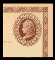
UNITED STATES
MINT
POSTAL CARDS
All Mint Postal Cards
have been
trasnferred to my NEW Website:
SteveLevineStamps-PLUS.com
RETURN TO HOME PAGE of this Website
Collecting U.S. Postal
Cards can be done on several levels. Like Envelopes & Cut Squares, there
are Die varieties, Plate varieties, Surcharge varieties, and Paper varieties.
There are also thousands of errors/freaks/oddities which are too minor to be
listed in any catalog...as well as hundreds which ARE listed. A good
basic Postal Card collection can contain several hundred varieties, and not set
you back the cost of a refrigerator. An advanced collection can contain
several THOUSAND cards, and set you back the cost of a house.
POSTAL CARD QUALITY: THE BUCK STOPS HERE
You should expect top quality while
recognizing that Postal Cards are not "stamps". Postal Cards are a
commercial product, and have only recently been printed with the needs of
collectors in mind. I buy carefully and weed out any obvious problems I
see. My major problem is with shrink-wrapped cards of the past 20 years.
Shrink-wrapping will, in time, warp the cards and mash the corners. How
much time? I have no answer. Sometimes the wrapping process itself
damages the cards; sometimes the damage takes years of storage.
THAT
issue aside, Postal Cards of
the past 60 years will look as if they came out of the Post Office yesterday --
clean, fresh, and with sharp strong corners.
Older cards, however, will usually show some signs of age and storage, as well
as characteristics of the era in which they were collected. Old-time
collectors saw no harm in writing a few small details, in pencil, on the backs
of a card. The Surcharged Cards of 1920 -- UX32 (on UX29), UX33 (on
UX30), and UY9 (on UY8) -- are often found with identification on the back, and
that's considered o.k. to most collectors. (These cards were surcharged in
46 different cities and are listed in the UPSS Postal Card Catalog.) Many
PLATE VARIETIES and DIE VARIETIES may also have light pencil I.D. on the back;
this is also considered acceptable.
POSTAL CARD STOCK - GENERAL
Postal Cards, like Envelopes, were a commercial product, and much variation
exists in the color, thickness, and "finish" (surface texture) of older Postal
Cards. This is especially true when a card was in service for several
years and was reprinted several times...and more so when different contractors
were employed. Among more recnt cards, the USPS used several suppliers of
paper, and their standards of manufacture are not all uniform.
PAPER
COLOR Most
Postal Cards were printed on only ONE type of card stock, so identification is
no problem. However, some of the older cards -- especially those, like
UX27, which was reprinted many times during its run of 37 years -- were printed
on several different shades of card stock. Some of these colors were
difficult enough to identify years ago, when the colors were fresh; now,
with aging, some of the shades are almost meaningless. Perhaps the worst
example is on UX27, the shades in question being CREAM and OFF-WHITE.
BUFF, on a card, is different from the BUFF on an envelope. Card "buff" is
a light manila/light brownish shade, and it varies considerably. Light
Buff can overlap a bit into dark cream. For some early cards, dark buff is
a scarce shade. Age and discoloration, however, can darken a card.
Yes, it's a mess.
THREE cards -- UX21, UX22 and UY5 -- were printed on blue paper. During my time as a dealer in Postal Stationery (starting in 1981) I've noticed fewer and fewer true "blue" cards. Many of them have discolored, slightly to greatly, from blue to grayish blue to brownish blue.
PAPER STOCK Thickness on most cards is uniform, though a few cards which had multiple print runs do show different thicknesses. One of the best-known is UX22. Identification is difficult, even with a micrometer; often, the a positive I.D. can only be made by a dealer -- like me -- who happens to have a "pack" in stock. The difference in thickness is obvious when measuring 25 cards; when measuring only ONE card, the difference is nearly impossible to measure.
PAPER FINISH The surfaces of cards often show a different "finish". Most which had limited print runs will show either a rough or a smooth finish. Some -- like UX23 -- will exist with both. If you try, for instance, to erase a pencil notation on the back of a rough-surfaced card (like UX1 or UX3), you won't notice the area where you erased. If you try that on a smooth-surfaced card (like UX23), that erased area will be obvious. Relative scarcity? Unknown.
SMOOTH AND COARSE PAPERS Further variety was added in 1973 with the use of "SMOOTH" and "COARSE" papers. The terms do NOT refer to the "feel" of the paper, or the roughness of the surface, though there is SOME connection. (If you put on a blindford and tried to I.D. smooth/coarse cards by their "feel", you'd be wrong more often than right...) What they refer to is how the cards look when you hold them up in front of a strong lightbulb. The best way to understand is to select a cheap issue, buy one of each, and hold it to the light. I can't explain it better.... AND, unfortunately, this smooth/coarse difference is a bit subjective, and varies for each issue. Not all issues exist both ways, and even the UPSS catalog ignores most of them. They are not scarce, though there is a slight premium, which is mostly for the extra time I have to put into I.D.'ing them.
FLUORESCENT PAPER Starting in 1963 with UX48/S66b the USPS began using fluorescent card stock on Postal Cards. This is a complex area, to say the least.
FIRST, some cards are made entirely of fluorescent paper; other are made of ordinary paper, but with fluorescent fibers embedded. More fibers, more brightness. At a distance, it's not obvious; up close, it is.
SECOND, some cards exist
ONLY on fluorescent paper, some exist ONLY on ordinary, "dull" paper, and some
exist both ways. When this happens, the fluorescent is GENERALLY more
scarce, but there are exceptions. UX120 and UY39 are 2 examples where the
"dull" paper commands a premium. Sometimes the premium is modest ($2
compared to 25c on many common issues), sometimes it's large ($13.50 compared to
60c on UXC4). There's one truly RARE issue, UX65 on dull paper. I've
never owned one in 34 years of dealing in this area!
THIRD. the degree of fluorescence varies. Some
cards exist across a range of brightness varying from faint to the "hi-brite"
reaction. Some cards exist only one way.
It's a bit subjective.
What's "medium" brite for one card may be "lo" brite for another. What's
really needed here is an objective scale. Unlike paper colors, which are
obvious, fluorescence is only observable under a special UV light. You
learn the various degree of fluorescence by accumulating cards and comparing
them.
IN GENERAL, I sell cards in 3 Categories:
Dull, Fluorescent Medium Bright, and Fluorescent High-Bright.
IN ADDITION, "Dull" paper also exists across a range of "dullness"...some being
just "flat", some having a somewhat "purplish" look to them. Some of the
cards I sell as Dull are actually VERY low bright fluorescent.
SURCHARGES There have been 2 major surcharge groups; one was created in 1920 when the USPS actually LOWERED the Postal Card rate from 2c to 1c and the other was crated in 1952 when the USPS raised the rate from 1c to 2c. Both of these events are of great significance to Postal card collectors.
Technically, the first
group -- which involved Scott #'s UX31, 32, 33, 34, 35, 36, UY9 and UY10 --
wasn't a surcharge; it was an overprint...or a re-value. Take your
pick...it was a rate decrease, and therefore, not a surcharge.
The first (1920) group was done in 46 cities for the
UXs, 14 cities for the UYs. Records were not well kept, and re-valuing
dies were often shipped from these major cities to smaller ones.
Due to this immense variety, it was the style at the time for collectors to record the city on the back of the card, in light pencil. Sometimes not so light...occasionally not pencil...and once in a while, on the front. Such markings are normal, should be expected, and do not detract from the value of the card.
PROCEDURES were a bit spotty, and many legitimate errors were created, as well as some freaks and oddities which are not listed in the catalogs. Varieties include: Doubles, inverts, inverts at the lower left, inverts at the LL plus regular surcharges. Stranger weeds sprout in the garden: Triples (and more), shifts, twisted surcharges, and various combinations of the aforementioned. Finally...whatever can appear on the FRONT of a card can also appear on the BACK, if the card is placed in the machine the wrong way.
Many of these varieties, while considered "favor" items by the Catalog people, are popular with collectors and have grown scarce with time. They're often more visually striking than the "legitimate" errors.
The second group -- UX39, 40, 41, 42 UY14 and UY15 -- was done only in a few cities, cutting down on the variety and eliminating the pencil markings...but not the varieties. Favor items were produced, even more creative than the 1920s. 3-4-5-6 or more surcharges exist on some cards, with a variety of placements, shifts, twists, ghosts, and even albinos! AS visually striking as the earlier group and more so, also pooh-poohed by the critics, and also much desired by collectors.
IN SUMMATION Collecting Postal Cards can be easy, or it can be complex and challenging. If you're one of my regular customers and you have a question, please feel free to e-mail or just pick up the phone & give me a call.
|
|